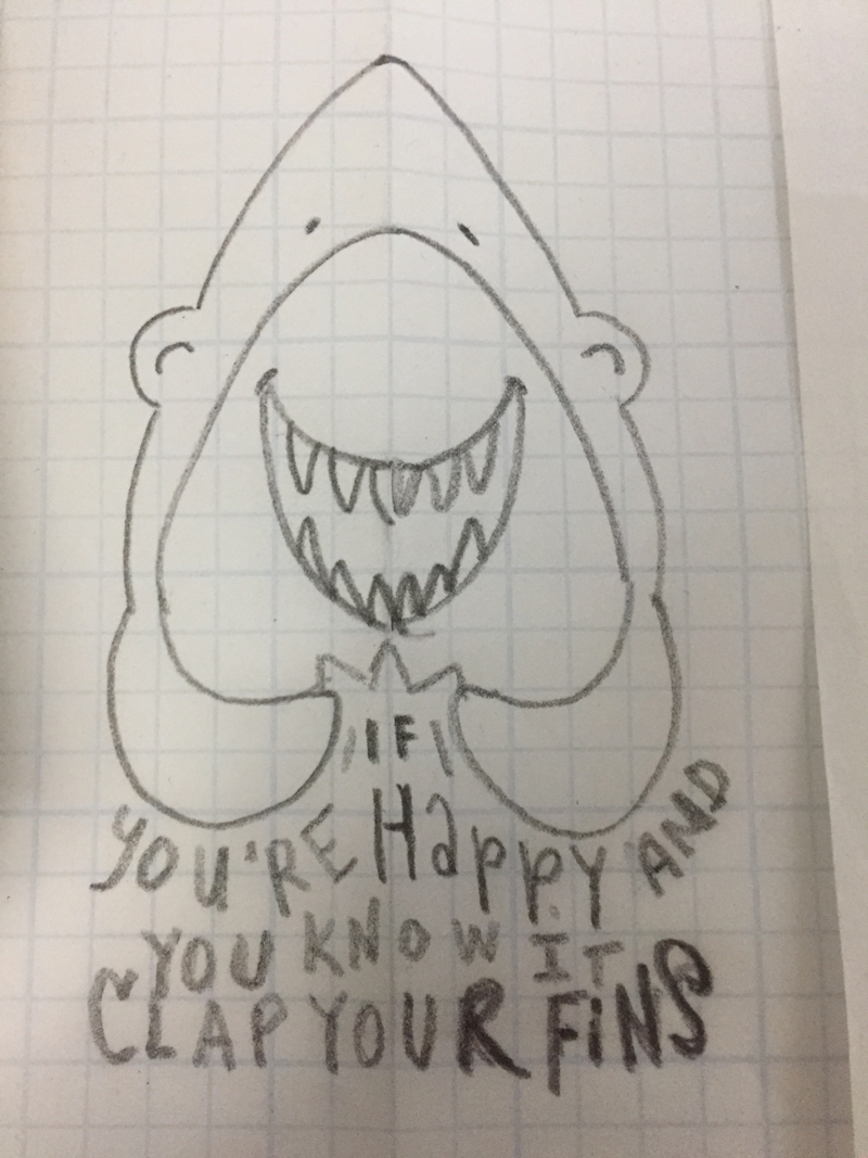
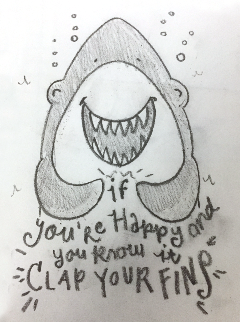
The first one is from my sketchbook. I liked the idea, a play off of both the "Jaws" movie poster, but less scary and more kid friendly AND a popular sing-a-long song. What I didn't like was the lettering. It was inconsistent in spelling and style, and over all just not good. I also didn't like that the drawing as so asymmetrical. I thought this sketch deserved a do over.
So, out came my gridded vellum. I redrew half of the shark, folded the vellum in half and drew the other half to have a symmetrical clapping shark. I then, using the space below the first shark, wrote out the "clap your fins" lines figured out where the breaks in the lines should land and where the centers should lay within those lines since I wanted the text to be center justified. I then very roughly laid out the text.
Finally I redrew the drawing once more on non-gridded vellum, taking more care with line quality, and the lettering.
I like it, think it's cute. Am thinking I might want to finish this out in either illustrator or photoshop to post next week for Shark Week. Because you know, sharks rock. That is unless they are trying to bite you. They almost never do that.


No comments:
Post a Comment